wisdomhoots

Industry 4.0

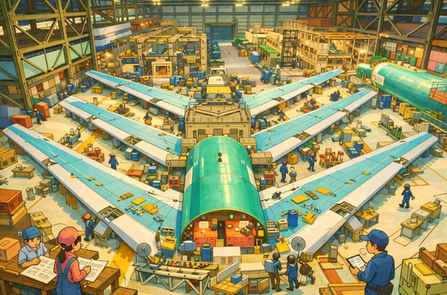
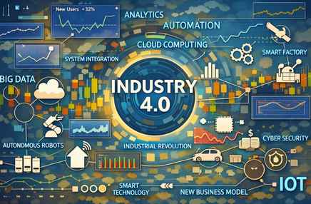
Focus Areas Industry 4.0 represents a fundamental shift in how manufacturing systems are designed, operated, and optimized. This module focuses on the evolution of industrial revolutions and the emergence of Industry 4.0 as a data-driven paradigm. It explores Industry 4.0 frameworks and characteristics, key technologies and design principles, smart manufacturing and product development practices, advanced robotics and additive manufacturing, and the use of maturity models to guide adoption. Learning Objectives After completing this module, learners will be able to explain Industry 4.0 and its historical evolution, identify its benefits and challenges, and describe the key technologies that enable it. Learners will also be able to apply Industry 4.0 design principles, understand maturity indices and frameworks, explain smart manufacturing and digital product development, and recognize advanced use cases such as autonomous robots and additive manufacturing. Evolution Of Industrial Revolutions Industrial development has progressed through four major revolutions. Gaps exist because each revolution required enabling technologies to mature. Industry 1.0 introduced mechanization through steam and water power. Industry 2.0 enabled mass production using electricity and assembly lines. Industry 3.0 brought automation through electronics, IT systems, and programmable logic controllers (PLCs). Industry 4.0 builds on these foundations by integrating cyber-physical systems and enabling data-driven, intelligent manufacturing. Industrial Revolution Approximate Timeline Industry 1.0 ~1760–1840 Industry 2.0 ~1870–1914 Industry 3.0 ~1970–2000 Industry 4.0 ~2011–present The evolution from Industry 1.0 to Industry 4.0 represents a shift from mechanized manual labor to mass production, then automated manufacturing, and finally to intelligent, connected, and data-driven manufacturing systems. In enterprises such as Boeing, this evolution is reflected in the transition from manual aircraft assembly to digitally integrated smart factories. Industrial Stage Core Focus Manufacturing Example (Analogy) Industry 1.0 Mechanization Manual assembly with mechanical tools Industry 2.0 Mass production Electrified assembly lines and standardized parts Industry 3.0 Automation CNC machines, PLCs, robotic drilling Industry 4.0 Intelligence & connectivity Digital twins, IIoT, simulation-driven automation Industry 1.0 refers to the first industrial revolution, occurring roughly between 1760 and 1840, characterized by mechanization through steam and water power. Industry 1.0 introduced mechanization through steam and water power. Industry 1.0 is associated with the First Industrial Revolution, which began in Britain and later spread to Europe and North America. Key enabling factors during this time: Steam engines (James Watt’s improvements in the 1760s–1770s), Water-powered machinery, Mechanization of textile and metalworking industries, Transition from cottage industries to early factories. Industry 1.0 marks the shift from manual craftsmanship to mechanized production using steam engines and water power. Machines assisted human labor, but control and skill remained largely manual.   When early aircraft manufacturing emerged in the early 20th century (including Boeing’s early years), production relied on: Hand tools and mechanically assisted equipment. Skilled craftsmen shaping and assembling parts. Limited standardization. Aircraft parts were built one at a time, with heavy dependence on human skill. Industry 1.0 introduced mechanical assistance to human labor but lacked standardization, automation, and scalability. Industry 1.0 predates Boeing (founded in 1916). Boeing did not operate during Industry 1.0. But Industry 1.0 laid the manufacturing foundations: Mechanization, Factory-based production, Standardized mechanical processes. Although Boeing emerged much later, its manufacturing heritage builds on principles first introduced during Industry 1.0. Industry 2.0 refers to the second industrial revolution, occurring roughly between 1870 and 1914, characterized by electrification, assembly lines, and mass production. Industry 2.0 enabled mass production using electricity and assembly lines. Industry 2.0 introduced electric power, enabling assembly lines and mass production. Products were standardized, and work was broken into repeatable tasks. Key characteristics: Electrification. Assembly-line production. Division of labor. Standardized parts.  Boeing context: Boeing was founded in 1916, right at the end of Industry 2.0. Early Boeing manufacturing strongly reflected Industry 2.0 principles. Examples: Electrically powered tools, Assembly-line-style aircraft production,  Standardized aircraft components, Rapid scaling of production during wartime.  As Boeing scaled aircraft production (especially during wartime and commercial aviation expansion): Electrically powered tools replaced mechanical ones. Aircraft assembly was organized into stations. Parts and subassemblies were standardized. Production volumes increased significantly. Aircraft moved along assembly  lines rather than being built entirely in one place. Industry 2.0 enabled scale and consistency through electrification and assembly-line manufacturing. Industry 1.0 Industry 2.0 Steam & water power Electricity Mechanization Mass production Craft-based work Assembly-line work Small factories Large industrial plants Industry 3.0 (1970–2000) introduced automation through electronics, IT, and PLCs, enabling programmable and repeatable manufacturing processes. Industry 3.0 introduced automation using electronics and computers. Key enablers: Electronics and semiconductors. Computers and IT systems. PLCs (Programmable Logic Controllers). CNC machines. Early industrial robots. Manufacturing systems could now: Execute pre-programmed logic, Reduce human intervention, Improve precision and repeatability. CNC stands for Computer Numerical Control. CNC is a manufacturing method where machines are controlled by computer programs instead of manual operation. The computer tells the machine exactly what to do, how fast, and where to move.  Systems were automated, but mostly standalone and siloed. For Example, at Boeing, Industry 3.0 is seen in: CNC machining of aircraft structural components. PLC-controlled drilling and fastening equipment. Early industrial robots performing repetitive tasks. IT systems supporting production planning and tracking. Automation improved quality and consistency, but data was not yet fully connected across the enterprise.  CNC is how software controls physical manufacturing. A CNC machine: Cuts, drills, mills, or shapes material. Follows precise digital instructions. Repeats the same operation with high accuracy. Common CNC machines: CNC milling machines, CNC lathes, CNC drilling machines, CNC machining centers. How CNC Works (Step by Step): Engineers create a digital design (3D CAD model). The model is converted into machine instructions (G-code). The CNC controller reads the instructions. Motors move the cutting tool along precise paths. The part is produced with micron-level accuracy. Once programmed, the machine can run with minimal human intervention. Why CNC Was a Big Deal (Industry 3.0): Before CNC: Machines were manually operated. Accuracy depended on operator skill. Repeatability was limited. With CNC: Precision is consistent. Complex geometries are possible. Automation becomes feasible. This is why CNC is a core pillar of Industry 3.0 (automation). Boeing Example: CNC in Aircraft Manufacturing. At Boeing, CNC machines are used to: Drill thousands of precise holes in aircraft fuselage panels.  Machine wing ribs and spars from aluminum or titanium. Mill structural components with extremely tight tolerances. Ensure parts fit perfectly during assembly. Even a tiny deviation can affect aircraft safety — CNC ensures repeatability and precision. CNC and Robots often work

Digital Manufacturing

Focus Areas Digital Manufacturing can be defined as: The enterprise-wide use of digital technologies, data, and models to design, plan, simulate, execute, and optimize manufacturing products and processes across their entire lifecycle. Digital Manufacturing is the overarching enterprise capability that integrates digital models, data, and technologies to design and optimize manufacturing, while Robotics and Automation are enabling technologies that execute physical production tasks within that digital framework.  Digital manufacturing includes robotics and automation, along with digital models, data, and lifecycle integration. Key points embedded in this definition: + It is enterprise-wide (not just shop-floor automation)+ It spans the full lifecycle (design → production → operation → optimization)+ It is data- and model-driven+ It integrates people, processes, and technology In simple terms: Digital Manufacturing is how manufacturing becomes intelligent, connected, and adaptive. Industry 4.0 defines the vision of intelligent, connected manufacturing; Digital Manufacturing is the enterprise capability that realizes this vision through digital models and data; and the Smart Factory is the operational environment where these capabilities are executed using robotics and automation. Digital Manufacturing is an enterprise-level capability that uses digital models, data, and simulations to design, plan, execute, and optimize manufacturing across the product and process lifecycle. Core idea: “How we design and manage manufacturing digitally before and during execution.” What it includes: Product digitalization (MBE, DPD), Process digitalization (digital workflows, MES), Simulation and OLP, Digital twins, Integration of robotics & automation, Data and analytics. Digital Manufacturing is how an enterprise implements Industry 4.0 principles in manufacturing. Digital manufacturing represents a fundamental shift in how modern factories operate and deliver value. At its core, it focuses on the digitalization of manufacturing processes and products, supported by advanced robotics and automation, offline programming (OLP) and simulation development kits, and the use of Digital Twins across the manufacturing lifecycle.  Together, these focus areas enable organizations to design, produce, and optimize products faster, safer, and with higher quality.  A Smart Factory is a digitally enabled production environment where machines, systems, and people are connected and capable of autonomous or semi-autonomous operation. Core idea: “The factory that results when digital manufacturing is applied.” Typical capabilities: Connected machines and sensors, Automated and robotic production, Real-time monitoring and control, Predictive maintenance, Adaptive scheduling and quality control. Key distinction: A smart factory is an outcome, not a strategy. Dimension Industry 4.0 Digital Manufacturing Smart Factory Nature Vision / paradigm Enterprise capability Operational implementation Scope Industry-wide Enterprise-wide Factory-level Focus What to become How to design & manage How production runs Level Strategic Tactical + strategic Operational Includes robotics? Yes (conceptually) Yes (as an enabler) Yes (physically deployed) Time horizon Long-term Medium-to-long term Real-time / day-to-day Digital technologies in manufacturing are software, data, and connectivity-based tools—such as digital product models, IoT, simulation, and digital twins—that transform physical manufacturing into a data-driven and optimizable enterprise capability. They replace manual, paper-based, or isolated physical decisions with digital models, data, and software logic. Learning Objectives After completing this module, learners will be able to: + Explain digital manufacturing in an enterprise context+ Differentiate between process digitalization and product digitalization+ Understand the role of robotics and automation in production environments+ Describe OLP and simulation tools used in modern factories+ Explain how Digital Twins support manufacturing operations Digital Manufacturing – Concept & Enterprise View Digital Manufacturing is the integration of: + Digital technologies+ Data-driven decision-making+ Automation and robotics+ Simulation and digital twins These capabilities come together to design, build, and operate physical products more efficiently. From an enterprise perspective, digital manufacturing is not just about machines—it connects business strategy, engineering, operations, and IT into a unified digital ecosystem. Digitalization of Manufacturing Processes Process digitalization focuses on transforming how work is executed on the shop floor. Key elements include:+ Paperless shop floors, replacing manual documentation with digital systems+ Automated work instructions delivered directly to operators+ IoT-enabled machines that continuously generate operational data+ Real-time quality monitoring to detect defects early+ Data-driven production planning for optimized scheduling and throughputThe result is greater visibility, consistency, and responsiveness in manufacturing operations. Digitalization of Products (Example: Aircraft) Digital Process Technologies define how the product will be built. Examples: Manufacturing process planning software, Digital work instructions, Manufacturing Execution Systems (MES). Example In practice: Assembly steps are defined digitally, Operators receive tablet-based instructions, Changes are instantly propagated. The process itself becomes software-controlled. Product digitalization focuses on how products are designed, defined, and managed digitally throughout their lifecycle. In complex products such as aircraft, this includes: + Model-Based Engineering (MBE) to replace drawing-based design: MBE replaces drawings with a living digital model that all engineering, manufacturing, and automation activities depend on. Model-Based Engineering is an engineering approach where a single digital product model, containing geometry, tolerances, and functional data, serves as the authoritative source for design, manufacturing, automation, quality, and lifecycle management. Model-Based Engineering (MBE) is an approach where: A single, authoritative digital model is used to define, analyze, manufacture, and maintain a product across its entire lifecycle. Instead of relying on multiple disconnected documents (drawings, spreadsheets, PDFs), the model becomes the system of record. Traditional (Document-Based Engineering): 2D drawings define the product, Manufacturing interprets drawings, Quality checks drawings, Changes require updating many documents. Problems: Ambiguity, Interpretation errors, Slow change management, Rework and scrap. Model-Based Engineering: 3D digital model defines the product, Geometry, tolerances, materials, and rules are embedded, All downstream users reference the same model. No interpretation — only execution. What Is Inside an MBE Model? An MBE model is much more than a 3D shape. It includes: Exact geometry, Dimensions and tolerances (PMI), Materials and specifications, Functional and structural relationships, Configuration and variants. Manufacturing and inspection intent. This is often called Model-Based Definition (MBD) — a core part of MBE. + Digital Product Definition (DPD) as the authoritative source of product data: Digital Product Definition (DPD) means: The complete and authoritative definition of a product is contained in a digital 3D model, not in 2D drawings. That 3D model includes all information required to manufacture, assemble, inspect, and maintain the product. In short: The model is new drawing now. DPD is the “what” and MBE is the “how”. Digital Product Definition is

Introduction to Data Visualization – VII

Data Visualization Objectives and chart selection What are objectives of visualization and what popularly known charts serve these visualization objectives? Story telling frameworks Storytelling frameworks help you structure information so it’s clear, persuasive, and action-oriented. Below is a comprehensive, structured list, grouped by use case, with simple explanations and examples (including data/business contexts like Superstore). Which One Should You Use? Since we work a lot with Tableau, dashboards, and Superstore-style datasets, the best combinations are:  SCQA + Data → Insight → Action | What–So What–Now What for explaining charts | Pyramid Principle for leadership presentations. A: Classic & Universal Storytelling Frameworks 1. Hero’s Journey (Joseph Campbell) Structure: Ordinary world → Call to adventure → Challenges → Transformation → Return with solution Use when: Long narratives, Case studies, Change management stories Data example: A struggling retail business → discovers losses → analyzes data → optimizes pricing → returns profitable. 2. Freytag’s Pyramid  Structure: Exposition → Rising action → Climax → Falling action → Resolution Use when: Explaining cause–effect, Process improvements, Incident analysis Data example: Sales decline → discounts increase → profits collapse → correction → recovery. B: Business & Executive Storytelling Frameworks 3. SCQA (Situation–Complication–Question–Answer)  Very popular in consulting Structure : Situation – What we know → Complication – What’s wrong → Question – What must we decide → Answer – Insight + recommendation Superstore example: Situation: Sales growing → Complication: Profit declining → Question: Why? → Answer: High discounts in Furniture → reduce discounts 4. Pyramid Principle (Barbara Minto) Structure: Start with the answer → Support with grouped arguments → Back with data Use when: Executive dashboards, Board presentations Example: “Profits fell due to 3 reasons: discounts, shipping, product mix.” 5. Problem–Solution–Impact Structure: Problem  → Solution  → Business impact Use when: Action-oriented dashboards, Recommendations C: Data & Analytics Storytelling Frameworks 6. Data Storytelling Flow (Most Common) Structure: Motivation (business question) → Data → Metrics → Visuals → Insights → Actions This matches our Superstore storytelling work very well. 7. DIKW Model Data → Information → Knowledge → Wisdom Data( Raw numbers) → Information (Organized data) → Knowledge (Patterns) → Wisdom (Decisions) Example: Orders → Profit trends → Loss drivers → Stop discounting 8. Before–After–Bridge Structure: Before: Current state   →  After: Desired state  → Bridge: How data helps move us there Great for: Transformation stories, KPI improvement narratives D: Persuasive & Marketing Storytelling 9. AIDA Attention → Interest → Desire → Action Use when: Selling an idea, Pitch decks, Data-driven persuasion 10. PAS (Problem–Agitate–Solution) Structure: State the problem → Show consequences → Present solution  Example: Losses → ignored will worsen → pricing fix E: UX & Product Storytelling 11. Jobs-to-Be-Done (JTBD) Structure: When ___   → I want ___   →  So that ___ Data example: When profit drops, I want a dashboard so I can identify loss drivers. 12. User Journey Mapping Structure: Awareness  →  Consideration  → Decision → Outcome Used heavily in product analytics and customer experience dashboards. F: Teaching, Training & Explanation Frameworks 13. What – So What – Now What Structure: What happened? → Why does it matter? → What should we do?  Excellent for explaining dashboards. 14. 5W1H Who, What, When, Where, Why, How Good for: Exploratory analysis, Root cause analysis G: Strategy & Change Storytelling 15. OKR Storytelling Objective (Why) → Key Results (How success is measured) → Initiatives (What we do) 16. Vision–Strategy–Execution Structure : Where we want to go → How we’ll get there → What actions we’ll take Summary (when to use what framework)  Framework Best For Hero’s Journey Long narratives, change stories, case studies Freytag’s Pyramid Cause–effect analysis, incident storytelling SCQA (Situation–Complication–Question–Answer) Executive communication, consulting-style data stories Pyramid Principle Decision-making, leadership presentations Problem–Solution–Impact Action-oriented recommendations Data → Insight → Action Analytics storytelling, dashboards DIKW Model Explaining data maturity and decision logic Before–After–Bridge Transformation stories, change initiatives AIDA Persuasive storytelling, pitches PAS (Problem–Agitate–Solution) Marketing and persuasive narratives Jobs-to-Be-Done (JTBD) User-centered product and data stories User Journey Mapping Customer experience and product analytics What – So What – Now What Dashboard explanation, insight communication 5W1H Exploratory analysis, root-cause analysis OKR Storytelling Strategy alignment, performance tracking Vision–Strategy–Execution Strategic planning and leadership narratives

Introduction to Data Visualization – VI

Data Visualization Objectives and chart selection What are objectives of visualization and what popularly known charts serve these visualization objectives? 4: Relationships When visualizing relationships between various data variables, whether for correlation, coordinate positions, outliers, or representing relationships in 2D Euclidean space, a variety of charts can be employed. The choice of visualization depends on the nature of the data and the specific relationships you want to highlight. When choosing a visualization, consider the characteristics of your data, the relationships you want to emphasize, and the insights you aim to extract. Combining multiple visualization techniques can provide a more comprehensive understanding of complex relationships in both structured and unstructured data: Scatter Plots: Display the relationship between two continuous variables. Scatter plots reveal patterns, trends, and outliers in the data, allowing for easy identification of relationships. Bubble Charts: Extend scatter plots by incorporating a third dimension with bubble size representing a third variable. Bubble charts add an extra layer of information, allowing for the visualization of three variables simultaneously. Heatmaps: Show the relationship between two categorical variables or a categorical and a continuous variable. Heatmaps use color intensity to represent the strength of relationships, making them effective for structured data. Correlation Matrix: Visualize the correlation between multiple variables. A correlation matrix provides a comprehensive view of pairwise relationships in a tabular or heatmap format. Line Charts: Display trends and relationships over time or a continuous variable. Line charts help identify patterns and trends in structured data, especially in time series analysis. BAR CHART LINE CHART SCATTER BUBBLE Parallel Coordinates Plot: Show relationships between multiple continuous variables. Parallel coordinates plots are effective for visualizing high-dimensional relationships and identifying patterns. Network Graphs: Visualize relationships between entities in a network. Network graphs are useful for revealing connections and interactions in unstructured data, such as social networks or citation networks. Scatter Plot Matrix: Display scatter plots for pairs of variables in a matrix format. Scatter plot matrices are helpful for identifying relationships and patterns across multiple dimensions in unstructured data. Chord Diagrams: Illustrate relationships and connections between entities. Chord diagrams are particularly effective for visualizing relationships between categories or groups in unstructured data. Hexbin Plots: Handle overplotting in scatter plots by grouping points into hexagonal bins. Hexbin plots are useful when dealing with a large number of data points and can reveal density patterns. PIE TREE MAP BOX PLOT TEXT TABLE HEAT MAP Spatial Plots (GIS): Represent relationships in geographical space. Spatial plots are effective for visualizing spatial relationships, such as the distribution of events on a map. Word Clouds: Illustrate the frequency of words in unstructured text data. Word clouds provide a visually appealing way to highlight important terms or concepts in text data. Force-Directed Graphs: Visualize relationships and connections in a network. Force-directed graphs use attractive and repulsive forces between nodes to reveal the structure of relationships. Topic Modeling Visualizations: Visualize topics and relationships in unstructured text data. Techniques like LDA (Latent Dirichlet Allocation) visualization can reveal the thematic structure of unstructured text. Tree Maps: Display hierarchical structures and relationships. Tree maps provide a space-filling visualization that is effective for showcasing hierarchical relationships in unstructured data. Sunburst Charts: Represent hierarchical relationships in a radial layout. unburst charts provide an engaging way to visualize hierarchical relationships in unstructured data.

Introduction to Data Visualization – V

Data Visualization Objectives and chart selection What are objectives of visualization and what popularly known charts serve these visualization objectives? 3: Composition When visualizing the composition of data, where you want to show the sum of a whole, the aggregation of parts, the breakup of the whole, or the relative contributions of segments or categories, various charts are available to effectively communicate these relationships. Choosing the appropriate chart depends on the nature of your data, the context, and the specific insights you want to convey about the composition of the whole. Consider factors such as readability, simplicity, and the ability to highlight key components: Pie Charts: Display the proportion of parts to a whole. Pie charts effectively show the percentage distribution of categories within a total, making it easy to understand the relative contributions. Doughnut Charts: Similar to pie charts but with a hole in the center. Doughnut charts share similarities with pie charts but allow for additional visual emphasis on the overall composition. Stacked Bar Charts: Show the total and the composition of individual parts. Stacked bar charts visually represent the cumulative total while breaking it down into segments, allowing for easy comparison. Stacked Area Charts: Similar to stacked bar charts but using areas instead of bars. Stacked area charts emphasize the cumulative total and highlight the contribution of each segment over time or along a continuous axis. Treemaps: Display hierarchical data structures and the relative size of categories. Treemaps visually represent the hierarchy and the proportion of each category in relation to the total. BAR CHART LINE CHART SCATTER BUBBLE 100% Stacked Bar Charts: Show the composition of parts as percentages of the whole. 100% stacked bar charts emphasize the relative proportions within the total, allowing for easy comparison of contributions. Waterfall Charts: Display incremental changes and the cumulative effect on a total. Waterfall charts are effective for illustrating how individual components contribute to the total and showcasing the flow of values. Sunburst Charts: Represent hierarchical data in a radial layout. Sunburst charts provide an engaging way to visualize hierarchical composition, especially when dealing with nested categories. Donut Charts: Similar to pie charts but with a hole in the center. Donut charts offer a variation on pie charts and can be visually appealing while still communicating the composition of parts. Funnel Charts: Show stages in a process and the conversion rates between stages. Funnel charts are useful for illustrating how a whole is progressively reduced or transformed through different stages. PIE TREE MAP BOX PLOT TEXT TABLE HEAT MAP Radial Bar Charts: Display bars arranged in a circular pattern. Radial bar charts are a creative alternative for illustrating composition, especially when dealing with a small number of categories. Bubble Charts: Purpose: Visualize three dimensions, with the size of the bubble representing a third variable. Bubble charts can be adapted to show the composition of parts by varying the bubble sizes based on their relative magnitudes.

Introduction to Data Visualization – IV

Data Visualization Objectives and chart selection What are objectives of visualization and what popularly known charts serve these visualization objectives? 2: Distribution Several types of charts are particularly relevant for visualizing data distributions and identifying characteristics such as normal tendency, range, outliers, percentiles, population distribution, clustering trends, and anomalies. Choosing the most relevant chart depends on the specific characteristics of your data and the insights you want to extract. Combining multiple visualizations can provide a comprehensive view of the distribution and help uncover patterns and anomalies: Histograms: Display the distribution of a continuous variable. Histograms show the frequency distribution of data, making it easy to identify the central tendency, spread, and potential outliers. Box-and-Whisker Plots (Boxplots): Summarize the distribution of a dataset and identify outliers. Boxplots provide a visual summary of the central tendency, spread, and skewness of the data. Outliers are explicitly highlighted. Kernel Density Plots: Estimate the probability density function of a continuous variable. Kernel density plots provide a smoothed representation of the distribution, helping to identify trends and anomalies. Violin Plots: Combine aspects of boxplots and kernel density plots to visualize the distribution. Violin plots provide a more detailed view of the distribution, offering insights into both central tendency and variability. Cumulative Distribution Function (CDF) Plots: Show the cumulative probability of a continuous variable. CDF plots help assess the proportion of data below a certain threshold, making it easier to understand population distribution and percentiles. BAR CHART LINE CHART SCATTER BUBBLE Q-Q (Quantile-Quantile) Plots: Compare the distribution of a sample to a theoretical distribution (e.g., normal distribution). Q-Q plots help assess normality and identify deviations from expected distribution patterns. Empirical Cumulative Distribution Function (ECDF) Plots: Display the cumulative distribution of observed data. ECDF plots are especially useful for comparing multiple datasets and understanding their distributional differences. Scatter Plots: Visualize relationships between two variables. Scatter plots can reveal clustering trends, relationships, and outliers, providing insights into the distributional characteristics of data points. Heatmaps: Display the distribution of values in a two-dimensional space. Heatmaps can reveal clustering patterns and anomalies, especially when applied to multivariate datasets. 3D Surface Plots: Visualize the distribution of three variables in a three-dimensional space. 3D surface plots provide insights into the joint distribution of three variables, revealing trends and anomalies. Rug Plots: Add small lines to the axis to indicate individual data points. Rug plots complement other visualizations, providing a simple representation of individual data points along an axis. PIE TREE MAP BOX PLOT TEXT TABLE HEAT MAP

Introduction to Data Visualization – III

Data Visualization Objectives and chart selection What are objectives of visualization and what popularly known charts serve these visualization objectives? 1: Comparison When comparing data variables in the context of data visualization, it means visually examining and interpreting the differences, rankings, gaps, outliers, or patterns present in the dataset. This process involves creating visual representations, such as charts or graphs, to make it easier to discern and understand the relationships between variables: Differences: Visualizing differences involves comparing the values of one or more variables to identify variations, contrasts, or disparities. Bar charts, line charts, and scatter plots are commonly used to highlight differences between data points. Ranking: Ranking involves ordering data points based on their values to determine their relative positions. Bar charts, column charts, and tables are often used to display rankings, making it easy to identify the top performers or outliers. Gaps: Visualizing gaps is about identifying spaces or intervals between data points. This can be useful for understanding discontinuities or missing values in a dataset. Line charts or area charts may reveal gaps in time-series data, while histograms can highlight gaps in the distribution of numerical values. Outliers: Outliers are data points that deviate significantly from the overall pattern of the dataset. Box plots, scatter plots, and histograms are effective in identifying and visualizing outliers. These visualizations help in assessing the impact of outliers on the overall distribution. Patterns: Patterns refer to recurring trends or structures within the data. Line charts, area charts, and scatter plots are useful for visualizing patterns over time or across different variables. Heatmaps and contour plots can reveal spatial patterns in two-dimensional datasets. Money (Monetary Values): When dealing with monetary values, such as revenues, costs, or profits, it’s important to visualize the financial aspects of the data. Bar charts, line charts, and stacked area charts can effectively represent financial data, allowing for comparisons and trend analysis. Beyond individual variables, it’s essential to visualize relationships between variables. Scatter plots, bubble charts, and correlation matrices help reveal how two or more variables interact with each other. Comparing data variables through visualization is a critical step in the data analysis process. It enables analysts and decision-makers to quickly grasp insights, identify trends, and make informed decisions based on the patterns and differences observed in the data. The choice of visualization techniques depends on the nature of the data and the specific aspects (differences, rankings, gaps, outliers, patterns) you want to emphasize. Charts are powerful tools for comparing data, enabling users to quickly understand relationships, variations, and trends within datasets. Different types of charts serve specific purposes in facilitating comparisons. The choice of the appropriate chart depends on the nature of the data and the specific comparisons you want to highlight. It’s often beneficial to experiment with different chart types to find the one that best conveys your intended message: 1. Bar Charts: Compare the magnitude of values across categories or groups. Clustered Bar Chart: Compares values within the same category side by side. Stacked Bar Chart: Displays the cumulative total of values, with each segment representing a category.2. Column Charts: Similar to bar charts, used to compare values across categories or groups. Clustered Column Chart: Compares values within the same category side by side. Stacked Column Chart: Displays the cumulative total of values, with each segment representing a category.3. Line Charts: Show trends over time or across a continuous variable. Line Chart: Connects data points with lines, making it easy to see trends. Area Chart: Fills the area under the line, emphasizing the cumulative total.4. Scatter Plots: Explore relationships between two continuous variables. Each point represents a data observation, and the positioning helps visualize correlations or patterns.5. Bubble Charts: Similar to scatter plots but adds a third dimension with the size of the bubbles representing a third variable. Useful for comparing three variables simultaneously. BAR CHART LINE CHART SCATTER BUBBLE 6. Pie Charts: Show the proportion of parts to a whole. Effective for displaying percentages and relative contributions of different categories.7. Treemap: Display hierarchical data structures and compare proportions across nested categories. Each rectangle represents a category, and the size corresponds to its proportion within the hierarchy.8. Radar Charts: Compare multiple quantitative variables represented on axes emanating from a central point. Useful for displaying multivariate data and comparing values across different dimensions.9. Box-and-Whisker Plots (Boxplots): Visualize the distribution and spread of a dataset. Boxplots provide a concise summary of the central tendency, dispersion, and outliers.10. Waterfall Charts: Display incremental changes in a value, often used for financial data. Helps visualize the cumulative effect of positive and negative changes. 11. Heatmaps: Display matrix-like data in a color-coded grid. Useful for visualizing relationships and patterns in large datasets, particularly in the context of two-dimensional data matrices.12. Comparison Tables: Present data in a tabular format for side-by-side comparisons. Allows users to compare numerical values directly and can include additional information. PIE TREE MAP BOX PLOT TEXT TABLE HEAT MAP

Introduction to Data Visualization – II

Data Storytelling Data Storytelling  is the process of converting business motivation and raw data into meaningful insights using metrics, dashboards, and stories. It starts with Motivation (Stakeholders / Business Context) — Why are we doing this? This is the starting trigger of the entire process. It answers: Who needs the analysis? What business problem are we solving? What decision needs to be made? Examples: Management wants to improve profitability, Sales head wants to know why revenue is declining, Operations wants to reduce delivery delays. Without motivation, analysis has no direction. Based on motivation (that could be identified using Goal-Question-Metrics method), the metrics data (i.e. both the dimension and measures) is ascertained and then the Data Sources are identified — What data do we have?. These are the raw inputs used for analysis. Examples: Transaction data, Customer data, Sales records, Operational logs, External datasets etc. The key idea :  Data may come from multiple sources, Data may be incomplete or messy, Understanding data origin is critical or Bad data sources = unreliable insights. Metrics = Dimensions + Measures — How do we model the data?. This step converts raw data into analytical structure. Dimensions → Describe data (Category, Region, Date, Customer) and Measures → Quantify data (Sales, Profit, Quantity, Time). Metrics are often derived measures: Profit Margin, Growth %, Average Delivery Time etc. Metrics define what is being measured. Analysis Flow (Top → Down Arrow): Once metrics are defined, analysis flows downward toward insights: Apply filters, Aggregate data, Compare segments, Identify patterns and anomalies etc. This is where: Charts, Calculations, Comparisons etc. happen. Meaningful insights are presented or visualized using appropriate charts or graphs etc. and collated for each stakeholder based on the GQM (enquiries) as Dashboards / Story — How do we communicate insights? This step focuses on presentation and narrative. Dashboards → Combine multiple views for monitoring and Stories → Guide users step-by-step toward conclusions. Purpose: Make insights understandable, Enable exploration, Support decision-making. Data only becomes valuable when people can understand it. Meaningful Insights — So what? This is the outcome of the process. An insight: Explains what happened,  Explains why it happened and Indicates what to do next. Example: “High discounts in Category X are causing consistent losses in Region Y.” Numbers alone are not insights — interpretation is. This process ensures that data analysis starts with business motivation and ends with meaningful insights, not just visuals. Simple Analogy Data Process Medical Analogy Motivation Patient complaint Data Sources Tests & reports Metrics Health indicators Dashboards Medical charts Insights Diagnosis Action Treatment Definitions: Data, Dimension, Measure, Metrics The right way is to think about a dataset before doing analysis, visualization, or storytelling. I: Key Concepts (Clear Definitions): Before touching the data, let’s align on terminology (many people mix these up). 1: Data (Raw Fields): All fields together. Includes dimensions + measures + IDs 2: Dimension Answers “By what?” : Descriptive fields. Used to slice, group, filter, categorize. Usually categorical or date/time. Dates are dimensions even though they look numeric. Dimensions describe the business context (who, what, where, when). Dimensions: Country, Region, Category, Segment, Ship Mode, Order Date 3: Measure Answers “How much / how many?” : Numeric fields. Can be aggregated (sum, avg, count, min, max).Measures: Sales, Profit, Quantity, Discount, Shipping Cost 4: Metric Answers “How well are we doing?” : A business-defined calculation. Often derived from one or more measures. Has business meaning.Metrics: Profit Margin, AOV, Sales Growth, Avg Shipping Cost II: Dimension vs Measure Classification (Superstore Dataset). Below is a typical Superstore dataset breakdown (matches your file very closely). A: DIMENSIONS (Descriptive / Categorical) 1: Geography Dimensions: Used to answer where questions. Country, Region, State, City, Postal Code, Market2: Customer Dimensions: Used to answer who questions. Customer ID, Customer Name, Segment3: Product Dimensions: Used to answer what is sold. Category, Sub-Category, Product ID, Product Name4: Logistics Dimensions: Used to answer how orders are fulfilled. Ship Mode, Order Priority5: Time Dimensions: Used to answer when questions. Order Date, Ship Date, Year, Quarter, Month, Day6: Identifier Dimensions: Used for granularity & joins, not aggregation. Order ID, Row ID B: MEASURES (Quantitative / Numeric) Measures are numeric values that can be aggregated. These are the raw numbers you aggregate. 1: Financial Measures: Sales, Profit, Discount, Shipping Cost2: Operational Measures: Quantity3: Derived Numeric Fields (still measures): Profit Ratio (if present), Shipping Days (Ship Date – Order Date) C: Metrics (Business-Level KPIs): Metrics are NOT raw columns — they are defined calculations. Metrics are business KPIs derived from measures to evaluate performance. 1: Sales Metrics: Total Sales = SUM(Sales), Average Order Value (AOV) = SUM(Sales) / COUNT(Order ID), Sales Growth % (YoY, MoM)2: Profitability Metrics: Total Profit = SUM(Profit), Profit Margin = SUM(Profit) / SUM(Sales), Loss Rate = % of orders with Profit < 03: Order Metrics: Total Orders = COUNTD(Order ID), Average Quantity per Order4: Logistics Metrics: Average Shipping Cost, Average Shipping Time, Cost per Order5: Discount Metrics: Average Discount, High Discount Order %, Discount vs Profit Impact III: How Dimensions + Measures + Metrics Work Together: Examples: 1: “Which sub-categories are profitable in each region?” : Dimension(s): Region, Sub-Category | Measure(s): Sales, Profit | Metric(s): Profit Margin2: “Do higher discounts lead to losses?” : Dimension: Discount (binned), Category | Measure: Profit | Metric: % Loss-Making Orders IV: How Tableau / Power BI Think About This Tableau View: Dimensions & MeasuresPower BI: Dimensions → Categorical columns and Measures → Explicit DAX measures Applying Key Concepts To Super Store Dataset Ref: Superstore Dataset STEP : Dimension–Measure Mapping Diagram (Conceptual + Practical) This step answers: “What type of data do I have, and how should I think about it before analysis or visualization?” High-level Mental Model (Very Important): Every analytics dataset can be split into three logical buckets: DATASET: DIMENSIONS (Describe) + MEASURES (Quantify) + METRICS (Evaluate performance) Dimension–Measure Mapping for Superstore Dataset: DIMENSIONS → Answer “By what?” These are descriptive fields used for: Grouping, Filtering, Slicing, Segmentation. Dimensions define the view MEASURES → Answer “How much / how many?”: These are numeric values that: Can be aggregated, Drive calculations. Measures define the value Dimensions describe the business context and are used for grouping, while measures are numeric values that can be aggregated. Metrics are business KPIs derived from measures. Detailed Mapping Table (Core of this Step) 1: Geography Dimensions: Country (Describes location), Region (Grouping geography), State(Drill-down), City (Fine-grain

Everest Bases Camp In Pictures

EBC Starting your day trip from Täsch, you can efficiently visit both the Matterhorn Glacier Paradise and Gornergrat in a single day. Here’s a detailed itinerary to help you make the most of your experience: Morning: Täsch to ZermattDeparture: Catch the Zermatt Shuttle Train from Täsch. Trains depart approximately every 15–20 minutes, starting as early as 05:55 AM. The journey takes about 12 minutes. Arrive at Zermatt Station, which is conveniently located near the departure points for both attractions. Matterhorn Glacier Paradise (Morning)From Zermatt, take the Matterhorn Express gondola to Trockener Steg, then transfer to the 3S cable car to reach the Matterhorn Glacier Paradise.  Cable cars operate year-round, typically from 9:00 AM to 4:00 PM. You can reach the Matterhorn Glacier Paradise directly from Zermatt via a series of gondola and cable car rides—there is no train service to the summit. There are two main gondola routes to reach the summit at Klein Matterhorn (3,883 meters).  (1) Direct Route (Faster): Zermatt → Furi: 7-minute gondola ride. Furi → Trockener Steg: 10-minute gondola ride. Trockener Steg → Matterhorn Glacier Paradise: 11-minute ride on the Matterhorn Glacier Ride, the highest 3S cableway in the world. This route is efficient and offers stunning views, especially on the final leg. Note that children under 3 years old are not permitted on the final segment due to altitude concerns . (2). Scenic Route via Schwarzsee (More Panoramic):  Zermatt → Furi: 7-minute gondola ride. Furi → Schwarzsee: 8-minute gondola ride. Schwarzsee → Trockener Steg: 9-minute gondola ride. Trockener Steg → Matterhorn Glacier Paradise: 8-minute ride. This route allows for a stop at Schwarzsee, offering unique perspectives of the Matterhorn and opportunities for photography . The journey is both scenic and efficient, taking approximately 40 to 45 minutes in total, depending on the route and transfer times. Explore the Glacier Palace. Enjoy panoramic views from the observation deck. Panoramic vistas of 38 Alpine peaks across Switzerland, Italy, and France. Visit the Cinema Lounge for informative films. Allocate approximately 2 hours for this visit. Operating hours may vary, so it’s advisable to check the latest schedule before your visit. Gornergrat (Afternoon)Visitors often take the cogwheel train (Europe’s highest open-air railway) from Zermatt to the summit. The ride itself offers breathtaking views.  The cogwheel train is the highest open-air railway in Europe. The ride provides spectacular views of the Matterhorn, Gorner Glacier, and surrounding 4,000-meter peaks. Return to Zermatt and board the Gornergrat Railway from the station directly opposite the main train station. Enjoy the scenic cogwheel train ride to the summit. Take in the 360-degree panoramic views of the Alps. Visit the highest alpine garden in Europe and Riffelsee Lake. Spend about 1.5 to 2 hours at the summit.  Trains run every 24 to 35 minutes, with the last descent varying by season. Numerous trails start or end at Gornergrat, including easy panoramic walks and more challenging alpine hikes. You might see marmots, ibex, and other alpine animals, especially in the summer months. The “Five Lakes Walk” is a popular trail offering reflections of the Matterhorn in mountain lakes. The clear skies and high altitude make Gornergrat an excellent spot for stargazing. There’s even an astronomical observatory (Gornergrat South Observatory).  There is a virtual paragliding experience available near Zermatt called “Zooom the Matterhorn”, located at the Gornergrat summit. This immersive attraction allows visitors to simulate a paragliding flight around the Matterhorn without leaving the ground. At “Zooom the Matterhorn,” you can embark on a simulated paragliding journey: Sit in specially designed chairs that mimic the sensation of flight. Wear virtual reality headsets that provide a 360° view of the alpine landscape. Use hand controls to steer your virtual paraglider, giving you the feeling of piloting through the skies. This experience offers breathtaking views of green meadows, rugged rocks, and majestic mountain ridges, culminating in a virtual circle around the Matterhorn’s summit cross at 4,478 meters above sea level. The Kulmhotel Gornergrat, also known as the 3100 Kulmhotel Gornergrat, is the highest hotel in the Swiss Alps, situated at an elevation of 3,100 meters (10,170 feet) above sea level on the Gornergrat ridge near Zermatt, Switzerland. Established in 1910, it offers guests unparalleled panoramic views of iconic peaks such as the Matterhorn and Monte Rosa, as well as 29 other summits exceeding 4,000 meters.  The hotel boasts 22 rooms, each named after a nearby 4,000-meter peak. Rooms are furnished with natural materials and offer views of either the Matterhorn or Monte Rosa massif.  The hotel houses two observatories, one in each of its towers. The southern tower was home to the KOSMA (Kölner Observatorium für SubMillimeter Astronomie) telescope, while the northern tower hosted the Gornergrat Infrared Telescope (TIRGO). These facilities have contributed to significant astronomical research. The hotel is accessible via the Gornergrat Railway, a cogwheel train that ascends from Zermatt to the summit station located approximately 100 meters from the hotel. Near the hotel, there’s a large viewing terrace open year-round. You get panoramic views of 29 peaks over 4,000 m, including the Matterhorn, Dufourspitze (Switzerland’s highest peak), and the Gorner Glacier. Recommendation: Consider purchasing the Peak2Peak Pass, which includes: Access to Matterhorn Glacier Paradise. Ride on the Gornergrat Railway. Use of the Matterhorn Express gondola. This pass offers a convenient and cost-effective way to experience both attractions in one day. Always check the weather forecast, as conditions can change rapidly in the mountains. Dress in layers to accommodate varying temperatures. Purchase tickets in advance to save time. Starting early ensures you have ample time to enjoy both attractions without feeling rushed. By following this itinerary, you’ll be able to experience the highlights of both the Matterhorn Glacier Paradise and Gornergrat in a single day, starting from Täsch. Incorporating a hike into your visit to Gornergrat is highly recommended, especially if you’re keen on experiencing the alpine landscapes up close. One popular option is to hike downhill from the Gornergrat summit to Riffelberg, passing by the picturesque Riffelsee lake. Recommended hike : Gornergrat to Riffelberg via Riffelsee. Starting Point: Gornergrat Summit (3,100 m). Ending Point: Riffelberg Station (2,600 m). Distance: Approximately 4–5 km. Duration: 1.5 to 2.5 hours, depending on pace and photo stops. Elevation Change: Descent of about

Industry Academia Collaboration

Industry–academia collaboration in FinTech AI-driven lending, blockchain, embedded finance, digital payments — technology moves faster than traditional curricula. Students often learn outdated theory, while industry demands cloud computing, data analytics, blockchain, and regulatory tech knowledge. Firms gain access to trained, job-ready talent familiar with their tech stack and processes. Universities can collaborate on cutting-edge solutions, proof-of-concepts, and pilot projects, reducing risk for companies. Collaboration Models I: Curriculum Co-Design Universities update courses to include FinTech technologies: blockchain, RegTech, AI in banking, cybersecurity, cloud-based auditing tools. Industry provides guest lectures, case studies, and capstone projects. II: Teaching and Learning Capabilities   b) Research Partnerships Joint research labs for: AI in risk assessment. Fraud detection & cybersecurity. Blockchain applications in trade finance. Industry provides data access, cloud resources, and funding. c) Experiential Learning Internships / Co-op Programs: Students work on real-world FinTech problems. Hackathons / Competitions: Industry-sponsored, outcome-driven challenges. Incubation & Mentorship: Students’ fintech projects get guidance from industry experts. d) Certification & Upskilling Short courses in emerging areas: digital payments, decentralized finance, ESG reporting tech, smart contracts. Certifications co-branded by university + company for credibility. 2: Academic Administration  2: Academic Administration : Academic Policy & Regulation Management, Academic Year Scheduling , Timetabling Management, Use Case Prism: The University of Canberra in Australia has introduced AI chatbots to assist with IT inquiries for students and HR queries for staff. Similarly, Deakin University offers a student application providing personalized information such as upcoming deadlines, voice-activated reminders, library bookings, and reading suggestions based on enrolled courses, as well as campus event updates. In Peru, Continental University has deployed ContiBot, a chatbot serving over 60,000 students across four campuses, delivering real-time academic information on schedules, grades, and other relevant data. 3: Curriculum Management 3: Curriculum Management : Curriculum Retirement Management, Curriculum Design , Curriculum Change Management, Professional Accreditation , Professional Learning (Staff) , Curriculum & Resource Development, Curriculum Performance Management Generative AI possesses the capability to produce personalized learning resources, curriculum materials, and instructional content customized to the unique needs and preferences of educators. Generative AI can support educators in the development and maintenance of curricula by automating the production of diverse learning materials, including textbooks, lecture notes, assignments, quizzes, multiple-choice questions (MCQs), and test papers, customized to the requirements of individual courses and educational goals. Leveraging AI in higher education enables educators to generate a wide range of questions spanning various difficulty levels, learning objectives, and subject matters. Employing Generative AI in higher education empowers educators to efficiently condense complex information into succinct summaries. Leveraging advanced Natural Language Processing (NLP) capabilities, Generative AI can thoroughly analyze and comprehend lengthy texts, extracting key concepts and summarizing pertinent details with precision. Consider a scenario where a professor needs to condense a dense, 50-page document for an upcoming lecture. Instead of dedicating hours to manually distilling the information, the professor can leverage a Generative AI tool. Upon inputting the text, the Generative AI algorithms meticulously analyze the document, discerning crucial events, figures, and themes. Subsequently, the tool generates a succinct and coherent summary, seamlessly integratable into the lecture. 4: Student Attraction & Recruitment : Scholarship & Bursary Management, Prospective Student Engagement , International Student Recruitment , Domestic Student Recruitment , Student Recruitment Agent Management As the perceived value of a higher education degree undergoes examination, students are increasingly seeking tangible returns on their investment of time and money. While global instability and economic downturns traditionally push students towards higher education, the widening skills gap and volatile job market present challenges in attracting new students to the industry. In today’s intricate and competitive landscape, universities face numerous challenges. University leaders rely on CIOs to implement transformative initiatives that address sector-specific concerns like student recruitment, retention, and academic achievement. Alumni Engagement, Student Completion & Graduation , Student Administration 5: Alumni Engagement : Alumni Relationship Management , Alumni Event & Campaign Management, Benefactor Management 6: Student Completion & Graduation: Graduation Event Management, Graduation Record Certificate Management, Non-Academic Achievement Management, Graduation Eligibility Management Blockchain Credentials: Blockchain technology enables secure and tamper-proof recording and verification of academic credentials, such as degrees, certificates, and transcripts. By issuing credentials on a blockchain, institutions ensure their authenticity and facilitate seamless verification by employers and other institutions, reducing the risk of credential fraud and simplifying the credentialing process. 7: Student Administration : Enrolment Status Management, Student Record & Details Management, Programme Transfer Management, Student Mobility , Student Exceptional Factors Misconduct / Appeal Management, Student Financial Administration 8: Student Support & Wellbeing Management  8: Student Support & Wellbeing Management : Career & Employability Engagement Mgt , Academic Skills Development, Academic Advice Management , Student Financial Advice, Student Engagement & Retention , Housing Advice , Personal Tutor Provision , Student Health & Wellbeing , Disability Support Management, Personal Learning Management Generative AI platforms offer round-the-clock personalized support, providing timely interventions and fostering interaction tailored to individual wellness requirements. By leveraging AI, virtual communities and engagement circles can be enhanced, serving as valuable supplements to face-to-face interactions, particularly in situations of illness or geographic isolation. AI can aid recent graduates in their job search by offering various support services, such as resume building, skill matching with job requirements, and salary negotiation insights. For instance, AI can enhance resumes based on job specifications and highlight key details from resumes and LinkedIn profiles to optimize job applications. Use Case Prism: AI has found application in extracurricular training, notably in activities like mock job interviews. Duke University in the USA has embraced AI-mediated services for this purpose. These services involve analyzing video recordings of participants and providing feedback on various aspects such as vocal delivery, keyword usage, and non-verbal communication. Such feedback proves beneficial for all types of future interviews, especially those conducted virtually, where AI systems similar to those used in training exercises may analyze or directly conduct the interviews. Use Case Prism: Despite the widespread adoption of predictive AI-driven early warning systems, students’ perceptions of such tools are often overlooked. A study by Universitat Oberta de Catalunya (Spain) evaluated students’ experiences with their university’s predictive system, which forecasts course failure risk using past academic data, represented by a traffic light