
Data Storytelling
Data Storytelling is the process of converting business motivation and raw data into meaningful insights using metrics, dashboards, and stories. It starts with Motivation (Stakeholders / Business Context) — Why are we doing this? This is the starting trigger of the entire process. It answers: Who needs the analysis? What business problem are we solving? What decision needs to be made? Examples: Management wants to improve profitability, Sales head wants to know why revenue is declining, Operations wants to reduce delivery delays. Without motivation, analysis has no direction.
Based on motivation (that could be identified using Goal-Question-Metrics method), the metrics data (i.e. both the dimension and measures) is ascertained and then the Data Sources are identified — What data do we have?. These are the raw inputs used for analysis. Examples: Transaction data, Customer data, Sales records, Operational logs, External datasets etc. The key idea : Data may come from multiple sources, Data may be incomplete or messy, Understanding data origin is critical or Bad data sources = unreliable insights.
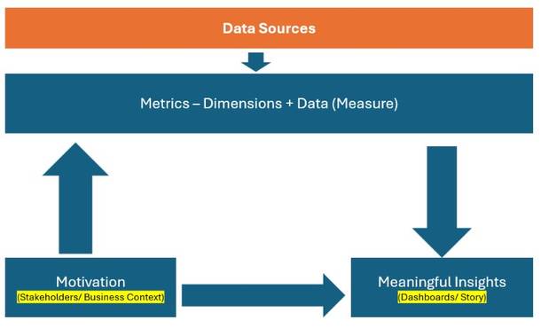
Metrics = Dimensions + Measures — How do we model the data?. This step converts raw data into analytical structure. Dimensions → Describe data (Category, Region, Date, Customer) and Measures → Quantify data (Sales, Profit, Quantity, Time). Metrics are often derived measures: Profit Margin, Growth %, Average Delivery Time etc. Metrics define what is being measured. Analysis Flow (Top → Down Arrow): Once metrics are defined, analysis flows downward toward insights: Apply filters, Aggregate data, Compare segments, Identify patterns and anomalies etc. This is where: Charts, Calculations, Comparisons etc. happen.
Meaningful insights are presented or visualized using appropriate charts or graphs etc. and collated for each stakeholder based on the GQM (enquiries) as Dashboards / Story — How do we communicate insights? This step focuses on presentation and narrative. Dashboards → Combine multiple views for monitoring and Stories → Guide users step-by-step toward conclusions. Purpose: Make insights understandable, Enable exploration, Support decision-making. Data only becomes valuable when people can understand it. Meaningful Insights — So what? This is the outcome of the process. An insight: Explains what happened, Explains why it happened and Indicates what to do next. Example: “High discounts in Category X are causing consistent losses in Region Y.” Numbers alone are not insights — interpretation is. This process ensures that data analysis starts with business motivation and ends with meaningful insights, not just visuals.
Simple Analogy
| Data Process | Medical Analogy |
|---|---|
| Motivation | Patient complaint |
| Data Sources | Tests & reports |
| Metrics | Health indicators |
| Dashboards | Medical charts |
| Insights | Diagnosis |
| Action | Treatment |
Definitions: Data, Dimension, Measure, Metrics
The right way is to think about a dataset before doing analysis, visualization, or storytelling.
I: Key Concepts (Clear Definitions): Before touching the data, let’s align on terminology (many people mix these up).
1: Data (Raw Fields): All fields together. Includes dimensions + measures + IDs
2: Dimension Answers “By what?” : Descriptive fields. Used to slice, group, filter, categorize. Usually categorical or date/time. Dates are dimensions even though they look numeric. Dimensions describe the business context (who, what, where, when).
Dimensions: Country, Region, Category, Segment, Ship Mode, Order Date
3: Measure Answers “How much / how many?” : Numeric fields. Can be aggregated (sum, avg, count, min, max).
Measures: Sales, Profit, Quantity, Discount, Shipping Cost
4: Metric Answers “How well are we doing?” : A business-defined calculation. Often derived from one or more measures. Has business meaning.
Metrics: Profit Margin, AOV, Sales Growth, Avg Shipping Cost
II: Dimension vs Measure Classification (Superstore Dataset). Below is a typical Superstore dataset breakdown (matches your file very closely).
A: DIMENSIONS (Descriptive / Categorical)
1: Geography Dimensions: Used to answer where questions. Country, Region, State, City, Postal Code, Market
2: Customer Dimensions: Used to answer who questions. Customer ID, Customer Name, Segment
3: Product Dimensions: Used to answer what is sold. Category, Sub-Category, Product ID, Product Name
4: Logistics Dimensions: Used to answer how orders are fulfilled. Ship Mode, Order Priority
5: Time Dimensions: Used to answer when questions. Order Date, Ship Date, Year, Quarter, Month, Day
6: Identifier Dimensions: Used for granularity & joins, not aggregation. Order ID, Row ID
B: MEASURES (Quantitative / Numeric)
Measures are numeric values that can be aggregated. These are the raw numbers you aggregate.
1: Financial Measures: Sales, Profit, Discount, Shipping Cost
2: Operational Measures: Quantity
3: Derived Numeric Fields (still measures): Profit Ratio (if present), Shipping Days (Ship Date – Order Date)
C: Metrics (Business-Level KPIs): Metrics are NOT raw columns — they are defined calculations. Metrics are business KPIs derived from measures to evaluate performance.
1: Sales Metrics: Total Sales = SUM(Sales), Average Order Value (AOV) = SUM(Sales) / COUNT(Order ID), Sales Growth % (YoY, MoM)
2: Profitability Metrics: Total Profit = SUM(Profit), Profit Margin = SUM(Profit) / SUM(Sales), Loss Rate = % of orders with Profit < 0
3: Order Metrics: Total Orders = COUNTD(Order ID), Average Quantity per Order
4: Logistics Metrics: Average Shipping Cost, Average Shipping Time, Cost per Order
5: Discount Metrics: Average Discount, High Discount Order %, Discount vs Profit Impact
III: How Dimensions + Measures + Metrics Work Together: Examples:
1: “Which sub-categories are profitable in each region?” : Dimension(s): Region, Sub-Category | Measure(s): Sales, Profit | Metric(s): Profit Margin
2: “Do higher discounts lead to losses?” : Dimension: Discount (binned), Category | Measure: Profit | Metric: % Loss-Making Orders
IV: How Tableau / Power BI Think About This
Tableau View: Dimensions & Measures
Power BI: Dimensions → Categorical columns and Measures → Explicit DAX measures
Applying Key Concepts To Super Store Dataset
Ref: Superstore Dataset
Chart Selection Matrix
| Question Type | Dimensions | Measures | Chart |
|---|---|---|---|
| Compare | 1 | 1 | Bar |
| Trend | Time | 1 | Line |
| Relationship | 0 | 2 | Scatter |
| Distribution | 0 | 1 | Histogram |
| Intensity | 2 | 1 | Heat Map |
| Hierarchy | 2+ | 1 | Tree Map |
| Precision | Many | Many | Text Table |
Applying This to Your Superstore Dataset (Examples)
| Question Type | Dimensions | Measures | Chart |
|---|---|---|---|
| Top 10 countries by sales | Country | Sales | Bar Chart (Sorted) |
| Discount vs Profit relationship | — | Discount, Profit | Scatter Plot |
| Profit by Region & Category | Region, Category | Profit | Heat Map |
| Sales contribution by Category & Sub-Category | Category → Sub-Category | Sales | Tree Map |
| How long does shipping take? | Order ID | Shipping Days | Gantt Chart |
Business Question → Chart → Story
| Business Question | Chart | Story |
|---|---|---|
| Top 10 countries by sales | Bar | Market prioritization |
| Discount vs Profit | Scatter | Pricing risk |
| Profit by Region & Category | Heat Map | Loss hotspots |
| Sales by Category & Sub-Category | Tree Map | Revenue concentration |
| Profit Distribution | Histogram | Risk exposure |
| Shipping Duration | Gantt | Process efficiency |
The Storytelling Ladder : DATA → CHART → INSIGHT → DECISION => Data: Discount & Profit → Chart: Scatter Plot → Insight: High discounts cause losses → Decision: Cap discounts at 30%
Common Storytelling Mistakes :  Showing charts without a question | Describing charts instead of insights | Too many charts, no narrative | No business implication
We now understand:  How charts map to business questions | How to extract insight | How to tell a business story
STEP : From Insights to Decisions & KPI (Metric) Design
This step answers the key executive question: “What should we track regularly to improve the business?”
| Concept | Meaning | Example |
|---|---|---|
| Insight | One-time understanding | “High discounts cause losses” |
| Decision | Action taken | “Cap discounts at 30%” |
| KPI / Metric | Ongoing measurement | “% Orders above 30% discount” |
KPIs turn insights into control mechanisms.
Core KPIs Derived from Your Dataset
We design KPIs around business objectives.
Objective 1: Increase Revenue
KPIs: Total Sales = SUM(Sales), Sales Growth % (YoY), Average Order Value (AOV) = SUM(Sales) / COUNTD(Order ID)
Supporting Charts: Line (trend), Bar (category comparison)
Objective 2: Improve Profitability
KPIs: Total Profit = SUM(Profit), Profit Margin = SUM(Profit) / SUM(Sales), Loss-Making Order %
Supporting Charts: Heat map, Scatter (discount vs profit)
Objective 3: Control Discounting
KPIs: Average Discount ,High Discount Order %, Discount Impact on Profit
Supporting Charts: Histogram, Scatter
Objective 4: Optimize Logistics
KPIs: Average Shipping Cost, Average Shipping Days, SLA Compliance %
Supporting Charts: Gantt, Bar
Objective 5: Product Portfolio Health
KPIs: Sales Share by Category, Profit Contribution by Sub-Category, Loss-Making Sub-Categories Count
Supporting Charts: Tree Map, Packed Bubble
KPI Design Template (Reusable)
| Element | Example |
|---|---|
| KPI Name | Profit Margin |
| Formula | SUM(Profit) / SUM(Sales) |
| Owner | Finance |
| Frequency | Monthly |
| Target | > 12% |
| Visualization | Bullet / Line |
Mapping Insight → KPI → Chart (Very Important)
| Insight | KPI | Chart |
|---|---|---|
| Discounts reduce profit | High Discount % | Histogram |
| Furniture losses | Profit Margin by Category | Heat Map |
| Slow deliveries | Avg Shipping Days | Gantt |
| Sales concentration | Sales Share | Tree Map |
KPI Dashboard Structure
KPIs are business metrics derived from measures to track performance over time. Insights inform decisions, while KPIs ensure those decisions are monitored continuously. Revenue KPIs | Profitability KPIs | Discount Control KPIs | Logistics KPIs | Product Portfolio KPIs
Common KPI Design Mistakes: Too many KPIs | KPIs without owners | Metrics without targets | Charts without decisions
We now understand: How insights become decisions | How decisions become KPIs | How KPIs map to charts
Lets us go through now the systematic approach to data story telling as outlined above in a summarized manner:
Step 1: Motivation (Stakeholders)
Goals, Questions, Metrics (Starting Point – WHY): This is the business context. Before touching data, we must know the stakeholders and the insights they need from data to take suitable actions or decisions:
Storytelling is not neutral — it is audience-driven.
Who cares about this analysis and why? Different stakeholders need different stories, even from the same data: A Category Manager is motivated to know which sub-categories are losing money. A Logistics Head is motivated to know average shipping days by ship mode etc.: CEO (Overall profitability & growth), Regional Manager (Region-wise performance), Category Manager (Loss-making products), Operations (Shipping delays & returns), Marketing (Impact of discounts).
Goal → What are we trying to achieve?
Questions → What do we need to understand?
Metrics → How will we measure success?
Superstore context: Example :
Goals: Improve profitability, Reduce losses, Increase customer retention, Optimize shipping performance
Questions: Which categories or sub-categories are causing losses?, Which regions are most profitable?, Do discounts negatively impact profit?, Are shipping delays affecting sales?
Example metrics: Sales, Profit, Profit Margin, Discount %, Quantity, Shipping Days
If goals and questions are unclear, dashboards become decorative, not useful.
Step 2 Data Sources (RAW MATERIAL)
This is where the data comes from.
Superstore context: Typical Superstore data sources: Orders table, Returns table, Customer details, Product hierarchy, Shipping details, Dates (Order Date, Ship Date)
Common mistake is jumping to charts without understanding data origin, grain, or limitations.
Example: Returns table is not joined correctly → wrong profit analysis or Order Date vs Ship Date confusion → wrong delivery metrics
Metrics = Dimensions + Measures (DATA MODELING)
This is the core analytical layer.
Dimensions → Describe data (Category, Region, Segment)
Measures → Quantify data (Sales, Profit, Quantity)
Superstore examples
Dimensions: Category, Sub-Category, Region, State, Customer Segment, Ship Mode, Order Date (Year, Month)
Measures: Sales, Profit, Quantity, Discount, Shipping Days (Calculated)
Example metric creation: Profit Margin = SUM(Profit) / SUM(Sales) or Avg Shipping Days = DATEDIFF(‘day’, Order Date, Ship Date)
Bad metrics = misleading insights, no matter how good the visualization looks.
Step 3: Charts / Graphs (Meaningful Insights)
Charts / Graphs. Choosing the right chart for the right question: Trend over time (Line chart), Compare categories (Bar chart), Distribution (Histogram) , Contribution ( Tree map) , Relationship ( Scatter plot)
Charts must be easy to read, no clutter. They need to be consistent. Same colors, scales, formats. They need to be relevant. Only show what answers the question. They need to designed based on set best practices. Avoid chart junk, unnecessary labels
Finally this is done in a tool (Ex. Tableau) as Worksheets → Dashboards → Story. This shows progression, not separate steps.
Worksheets: Answer one specific question. Example: Profit by Sub-Category, Sales Trend by Month, Discount vs Profit Scatter
Dashboards: Combine related worksheets, Enable comparison and context
Superstore dashboard example: “Profitability Overview Dashboard” Contains: KPI cards (Sales, Profit, Margin), Profit by Category, Loss-making Sub-Categories, Profit by Region
Story: A guided narrative. Each dashboard answers one chapter
Example story flow: Overall business health, Where profits come from, Where losses occur, Why losses happen, What to do next
Dashboards show data. Stories explain meaning.
Insights are: NOT charts, NOT numbers BUT interpretation
Superstore examples: “Furniture category has negative profit”
Insight: “Furniture losses are driven by high discounts in the Tables sub-category, especially in the Central region.”
Insight formula: What happened + Why it happened + Where it happened
Insights → Decisions / Actions (FINAL OUTCOME): This is the end goal of data storytelling. Insights must lead to: Decisions, Actions, Policy changes
Superstore action examples : Tables cause losses →Reprice or reduce discounts , Central region underperforms→ Review regional strategy, Same-day shipping costly → Restrict for low-margin orders, High discounts reduce profit→ Cap discounts by category
If no action is possible → the analysis is incomplete. Insights may raise new questions. New questions require new metrics. New metrics require new charts
Example: Loss found → Ask why → Analyze discounts → Create new metric → New dashboard


Trying out mh88. Interface seems pretty user-friendly. Let’s see if the payouts are quick. mh88
Just started on play karo. Quick registration and gameplay’s smooth so far. Giving it a thumbs up. play karo
Alright, so I finally figured out the 9kbosslogin thing. It was a bit confusing at first, but now I’m in and playing. Site’s alright. Seems legit. If you’re having trouble logging in, keep trying. Here’s the link: 9kbosslogin